

Photography Blog & Technical Insights
Tutorials, Field Notes & Visual Experiments
Welcome to my blog… a space where I share in-depth photography tutorials, behind-the-scenes field guides, and personal reflections on the craft. From planning wide-field astrophotography shoots and capturing celestial events like supermoons and meteor showers, to exploring post-processing techniques, archival photo restoration, and the evolving role of AI in creative workflows, you’ll find practical guides and visual case studies here.

How-to do GTA V Style Post-Processing
Want to give your photos that unmistakable GTA V poster style? This step-by-step post-processing tutorial reveals exactly how to achieve the illustrative look using Lightroom and Photoshop. Perfect for portraits and cityscapes—including Doha's stunning urban architecture. Learn the color grading, contrast adjustments, and sharpening techniques that transform ordinary images into game-art masterpieces. No expensive gear required. Just your camera, a RAW file, and this guide.


Want to give your portraits and cityscapes that unmistakable GTA V illustrative style? You have come to the right place. As an architectural and commercial photographer based in Doha, I am constantly looking for creative post-processing techniques that make my work stand out; whether I am shooting West Bay's skyline or an environmental portrait in an office. The GTA V poster style, with its bold colors, dramatic contrast, and almost painterly aesthetic, has always fascinated me. So I decided to reverse-engineer it and apply it to my own photography. In this tutorial, I will show you exactly how to achieve this look, from lighting setup to final color grade step by step. No complicated gear required. Just your camera, a RAW file, and a willingness to experiment.
In this tutorial, you will learn:
Lighting Setup 1: The exact lighting diagram and modifier placement to achieve the GTA V illustrative look straight out of camera.
Lighting Setup 2: A "Poor Man's Umbrella" alternative: achieving similar results with minimal, budget-friendly gear.
ACR/Lightroom Adjustments: The starting point: exposure, contrast, and tonal settings that set the foundation for the GTA style.
Dodging and Burning: Extensive shadow and highlight sculpting to create that dramatic, game-art depth.
The Black Outline Technique: The signature GTA V edge definition that gives portraits that unmistakable illustrative feel.
Color Balance & Contrast: Final color grading settings to lock in the complete GTA V aesthetic.
If you are new to night photography or planning shoots in Qatar, check out my Milky Way tutorial to understand the fundamentals of planning and location scouting.
Lighting Setup 1: For the GTA Look

Figure A

To be honest, I did not spend any time trying to decipher the look of GTA portraits, especially the lighting. But anyone who has ample experience working with multiple strobe/Speedlight setups can quickly understand that the lighting setup for these GTA portraits consists of a key light, likely a bare flash or strobe perhaps in a softbox with an egg crate as shown in figure A.
Studio photographers who shoot portraits of athletes commonly use a directional lighting setup to make their subjects stand out and give them that hard, tough, and badass look. Joel Grimes is a master at it. Here is a typical lighting setup that Joel uses for his sports studio portraits.
As you can notice in the photo above, the grids on the softboxes give off a directional light that creates the beautiful rim around the arms and face of the subject. It’s hard but not harsh. This is very similar to GTA posters, see below.
So if you are interested in achieving the authentic GTA look, go for the lighting setup shown in figure A.
Lighting Setup 2: Poor Man's Umbrella

Figure B
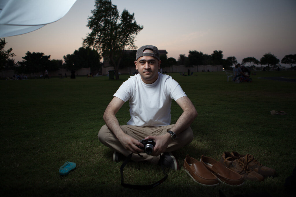
In my case, I only had one Canon flash behind a medium-size white umbrella placed camera left as shown in figure B. The shot was never intended for this purpose and it was just an outdoor family gathering where I happened to have a borrowed Canon 5D Mk II AND a borrowed Canon Speedlight. Of course, the model was also borrowed (it’s my creative younger brother).
Here is the SOOC (straight out of the camera) image. Can you see the umbrella on the top left? I’m sure you can.
GTA5 Post-Processing: The Starting Point

We are living in exciting times for photography and videography. Digital camera technology available today is truly magical and a lot can be done with it. Combine it with some serious Lightroom and Photoshop experience and the whole game changes. The dynamic range available on all modern DSLRs, mirrorless cameras, etc. is nothing short of extraordinary. So it’s a good idea to always shoot in RAW to be able to harness that potential in post-processing. Examining GTA5 posters closely, I noticed that it has defined shadows and detailed highlights. Luckily, getting close to that base look takes just a few seconds in Adobe Camera Raw or Lightroom. All I did was move the highlight slider to -100 and the shadows slider to +100 (see figure C).

Figure C
Doing that helped me recover maximum details from my 5D Mark II raw file in both the highlight and shadow areas, which is very important for this look. Here is what I got after those basic adjustments.
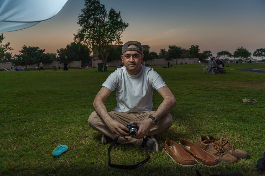
After applying adjustments in Fig. C
If you’d like, feel free to download my exact ACR settings from the link below: GTA Style (ACR settings)Pushing the highlights to -100 for maximum highlight recovery reduces image contrast significantly and makes the subject look flat and dull. So I used an adjustment brush in ACR to selectively increase contrast on the model as shown below.
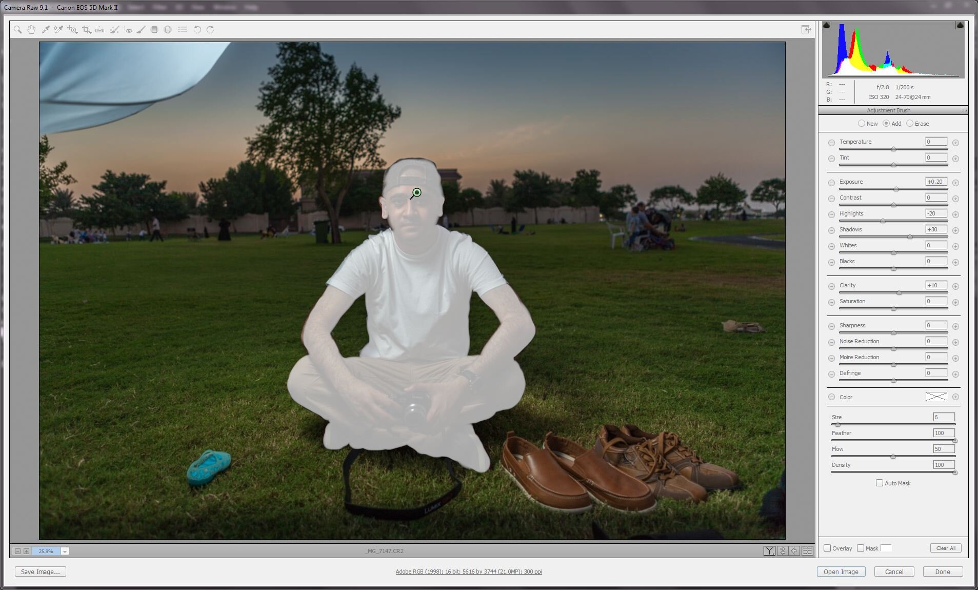
Masking using adjustment brush in ACR
The image is now ready for more detailed post-processing work in Photoshop. On a side note, the image has also started to resemble the signature look of Adrian Sommeling’s work although we haven’t done much yet. Now isn’t that a bargain?
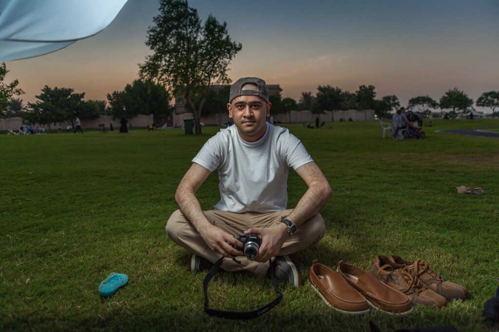
GTA5 Post-processing: The Magic Touches
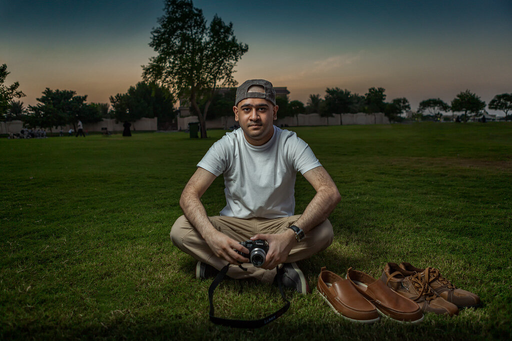
Cleaning up: The first thing I wanted to do after opening the file in Photoshop was clean up distracting elements, some of which in this case was the umbrella, people in the background, and trash. I used a combination of clone stamps, content-aware fill, and spot healing brush tools in Photoshop to clean up my composition.
Contrast: I wanted to emphasize the model so using Nik Viveza, I applied some global contrast to my taste. I also boosted the sky to mimic a blue GND filter. You can easily get the same results using Curves, Levels, and Gradient adjustment layers in Photoshop.
Vignette: To further focus attention on the model, I applied a vignette effect using Nik Color Efex Pro. Depending on your lighting setup, background color, ambient light, and even the model’s clothes, you may or may not even need to emphasize your subject using a vignette. But if you do, you can easily do it even in Photoshop. No need for any plugins. Here is what the image looked like after applying the above adjustments in Photoshop.
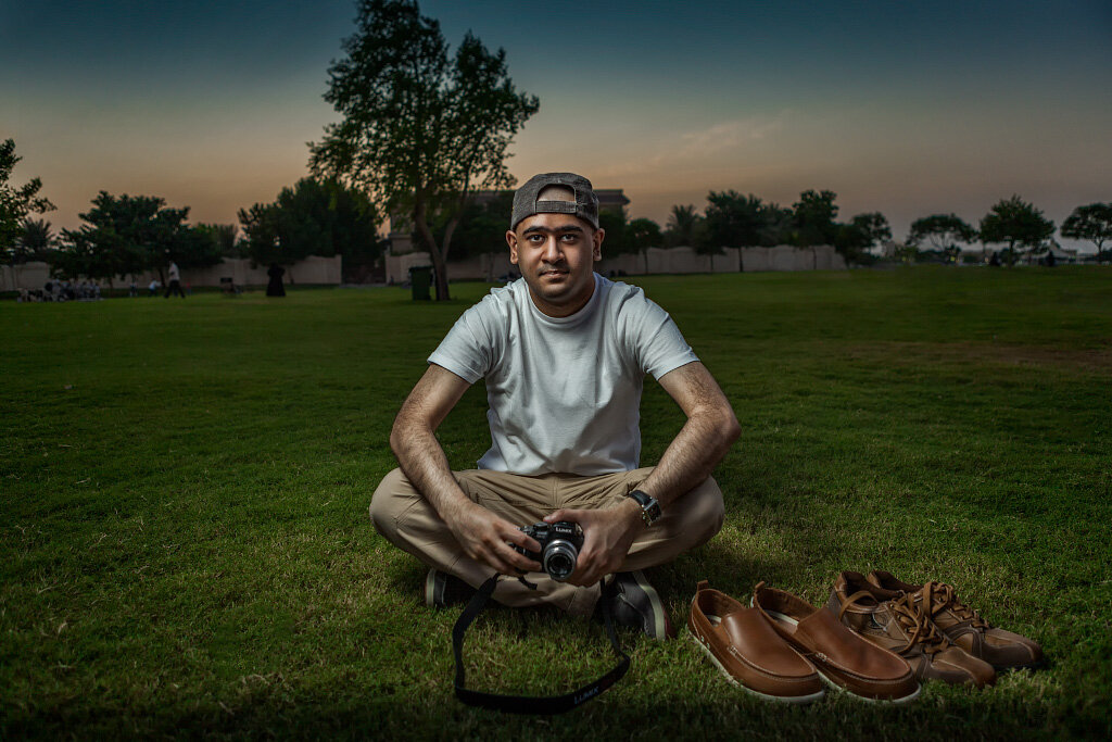
Painting Shadows & Highlights: One of the defining characteristics of GTA5 posters is the emphasized shadows and highlights. To get that look, I started with burning the shadows. First, I created a new layer filled with 50% gray and set the blending mode to Soft Light. Using an appropriate brush size, I started to paint on the layer with black. Make a note that when using the brush tool, you can vary its intensity by adjusting the opacity of the brush. I usually start with a brush opacity of 10% or 20%. To intensify the effect, I paint over and over while keeping the same opacity. After finishing with the shadows, I wanted to emphasize the highlights as well. So I changed the color of my brush to white and started painting on the same layer. My brush opacity remained between 10 - 20% but I varied the brush size as needed. Here is what my dodge and burn layer looked like after painting.
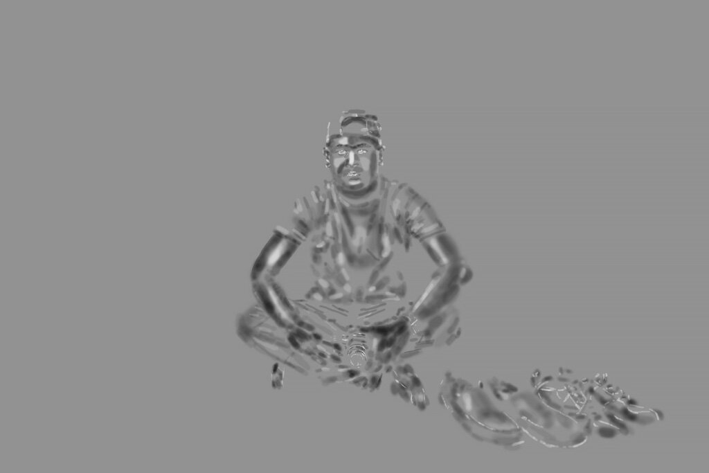
Dodging and burning
You can notice smaller strokes on the chin, nose, and eye areas. It’s a good idea to highlight these areas to focus on the face and add dimension and pop. Notice the white and almost black brush strokes on the arms to exaggerate the 3D effect, which helped me add an illustration-style touch. Here is what the image looked like with the painted shadows and highlights. Much better already… yeah!
Black outline: Another visual feature of GTA5 posters is a stroke around the subjects in the frame. This can be done as per your taste. I went with painting a rather thick and dark stroke around the border of the model, for two reasons. Firstly, because it’s an image with millions of shades of colors unlike a hand-drawn sketch with solid blocks of colors, so a thick stroke is what I needed to add adequate weight and effect to the image. A thin stroke would not have been visible. The second reason to go with a thick stroke was that the background is dark and busy. To create the stroke, I made a new layer with 50% gray, blending mode set to Soft Light. With the brush tool in the appropriate size, I painted along the border of the model in black color. Here is what my stroke layer looks like when switched to Normal blending mode. Note: make sure your stroke layer is set to Soft Light mode.
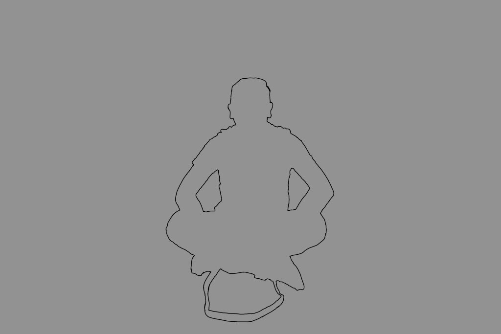
Black outline
The resulting image with the black outline looks like this.

Image with black outline
Color Balance & Color Contrast: As my model was outdoors sitting on the grass, the image seemed to have a greenish tint. I could have corrected it in ACR but it wasn’t very obvious before. Nothing to worry about because Photoshop layers can do the same. To minimize the green tint, I applied a Color Balance adjustment layer.
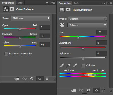
Color Balance adjustment
Also, the sky looked pale and was blending with the grass. Magenta creates a beautiful contrast with green so I changed the sky color using a Hue/Saturation adjustment layer.
Contrast & White balance: The contrast on the model is low and even though he was wearing a white shirt, it looks grayish. To correct the low contrast, I created a Levels adjustment layer with the selection of my model and pushed the white point inwards. The white t-shirt had an unpleasant blue tint which needed to be corrected. Using a Hue/Saturation adjustment layer with the selection of my model, I decreased the saturation of the blues to neutralize the tint. There are many ways to remove or minimize tint and color cast in Photoshop and you don’t have to follow the same method as shown here.

Levels and Hue/Saturation adjustment
With all the above adjustments applied, the image looks a lot better now. The sky does look beautiful in contrast to the green grass now.
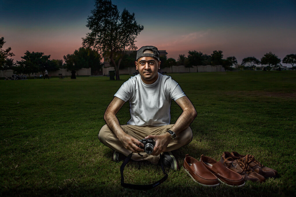
Final Touches & GTA5 logo: As far as post-processing is concerned, I think the image is looking great. Now the last thing to do is add the GTA5 logo and we are done. The logo was easy to get from Google and placement in Photoshop was done using drag & drop, as a Smart Object. I went with a high-resolution PNG of the GTA5 logo because it had a transparent background, making it ideal for adding drop shadow effect in Photoshop. To create a drop shadow effect on the logo, I duplicated the logo layer, rasterized it, and applied a Gaussian blur to it to make it softer. Then I offset the layer downwards and to the right of the logo layer on top. Finally, I added a layer mask to the shadow layer and painted the areas with a black brush where I didn’t like the shadow to appear and adjust the opacity of the shadow layer to taste. I also added another Levels adjustment layer to further brighten my model selectively using a layer mask. Here is the final image.
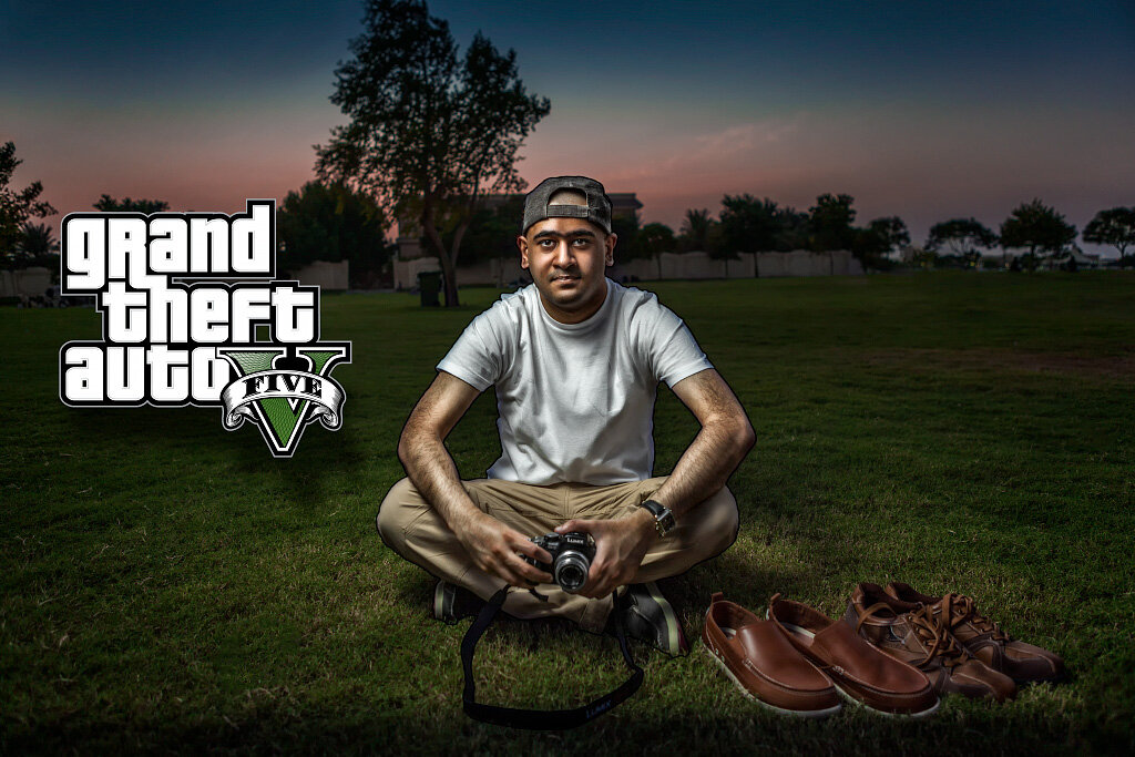
Final image with GTA logo
Another Example
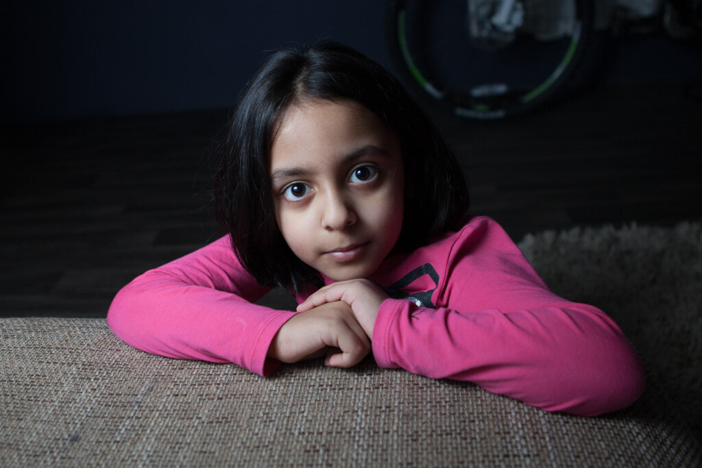
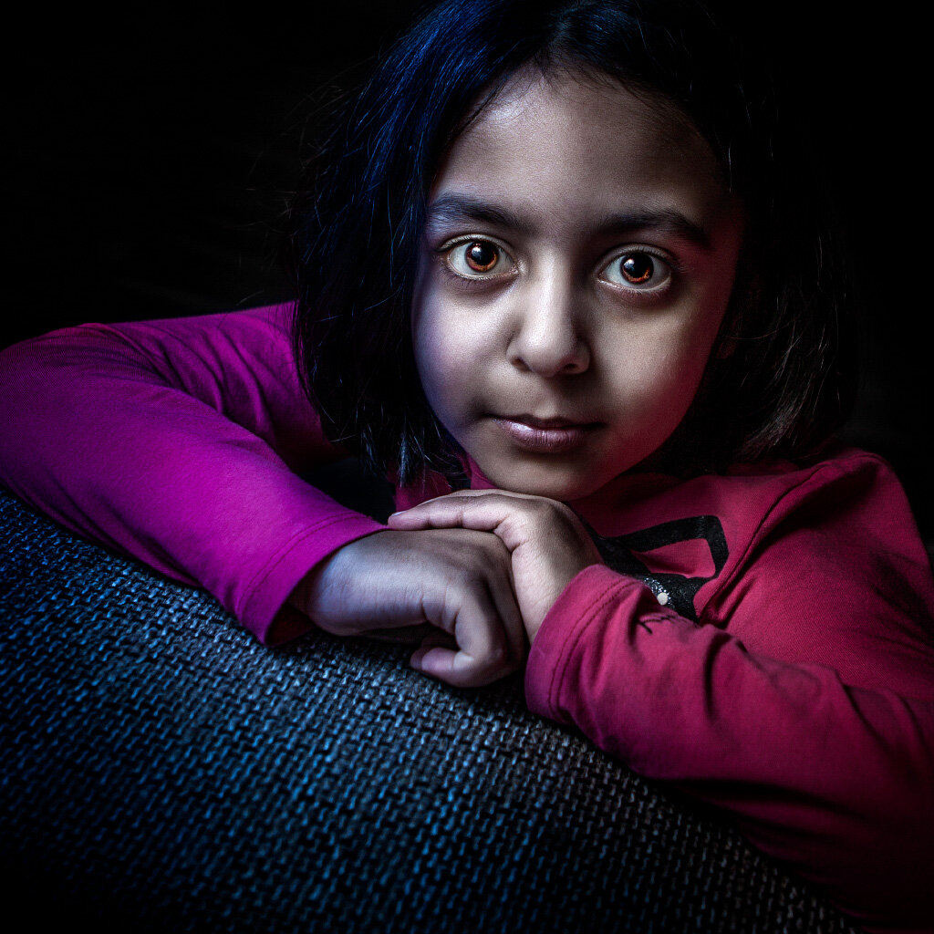
The above shot looks great and it’s just the beginning. The same technique can be applied to all kinds of portraits to get interesting results. Here is a simple portrait of my daughter that I shot indoors using the same lighting setup as shown in figure B.
Using the same post-processing technique with some additional color effects in Photoshop, I was able to achieve the following result.
As you can see, this technique holds incredible potential for creativity and is surprisingly easy to execute once you understand the core principles. Give it a shot; you will be amazed at how unique and striking your portraits and cityscapes will begin to look. And if you have access to a more sophisticated lighting setup, the results become even more astonishing. Just remember: always shoot in RAW. That single habit gives you the latitude you need to push colors and contrast this far without breaking the image. I hope you enjoyed this tutorial and learned something new. Now I cannot wait to see what you come up with using this technique. Try it out, share your work in the comments for feedback, and if you have any questions, drop me a note below. Happy shooting and processing GTA style. And if you are in Doha and want to see how this style works on Qatar's urban landscapes, send me a message… I would love to collaborate.